30 Oct

|
Getting your Trinity Audio player ready...
|
Common Design Mistakes: Web design is a serious work that requires total concentration to bring out the brand’s visions and aspirations. That is why you need the Best SEO Services. There is no room for mistakes. Any mistake in a design such as a logo, business card, website, or brochure, can potentially damage the prospects of a company. On the other hand, a well-designed website makes a company trustworthy to its target audience. Any perfectly designed logo will impress you when you look at it. All the attributes that represent the company and give it identity have been synchronized in a single logo.
Table of Contents
How to Avoid Common Design Mistakes?
There are hundreds of thousands of web designing companies in the world and very few do exemplary jobs. They don’t pay close attention to designing and marketing materials, leading to incompetence. They eventually end up losing clients who are very hard to find. If you don’t know, the majority of customers make their purchasing decisions based on the brand’s logo, brochure, website, blog, packaging, and other designs. Designs have elements that elicit certain emotions and if you can create a design that has the right signals, customers will be drawn towards it. Whether you are new in the designing world or a veteran, you should, by all means, check out for mistakes and do your best to avoid them. If you are wondering what mistakes I am talking about, here are some of them and how you can avoid them.
Pay monthly web design is also a new concept for professional web design at a low cost.
Not Understanding Instructions
The most important thing before settling down to do a designing project is to sit down with the client and try to understand what their business goals are. Therefore, communication is very important. Being the designer, it’s upon you to visualize what the client wants to achieve in his or her designs. Ask questions if you have not understood their business requirements. You need to understand that communication is not only done face to face, you can also send queries to ensure that you’ve completely understood their intentions. The best way to do this is by going through the client’s directives multiple times, taking notes, and brainstorming. It is critical that you contact the client whenever you are confused about the details of the directive. You are reading “Common Design Mistakes” at Phelix info Solution Blog.
Staying in the Box
Thinking out of the box doesn’t apply in the web design sector. Your opinion doesn’t matter. The client here should be the priority and all you have to do is present their thoughts visually. A major graphic design mistake in logo design and other designs is failing to stick to the client’s detectives and trying to please their ego. Graphic designing is a creative art that demands you bring out your A-game while sticking to the directive. For SEO Strategies, you can try out new ideas but don’t go overboard to implement them without consulting the client.
Too Many Fonts
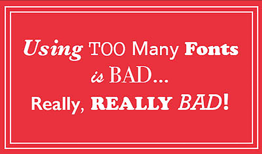
Fonts are fun to play around with but too much of them make your designs look destructive to the audience. It is irritating reading something that changes the font type in every sentence. The recommended number of fonts to be used in a single layout is three. More than that makes your layout ambiguous and confusing. The best strategy when designing a logo or a website is to use one or two fonts to give the brand its identity and also add continuity. Business cards should also have fewer fonts to make them easy to read and understand since they have limited space. You are read “Common Design Mistakes” written by Naman Modi.
Overthinking Everything
Keep things simple to the point. Having the power to add something in your designs doesn’t mean you should. If it doesn’t elevate the company’s thoughts and identity, leave it. Don’t go all crazy with Photoshop filter thinking that you are doing the client a favor. Although over designing isn’t a major mistake, it can lead to major problems later on. The more information you include in your designs, the harder it becomes for users to view and make sense of them. The design needs enough space to breathe and flourish. Having space in your designs isn’t a bad thing; it helps the reader pause for a while to process the information. Don’t just fill every centimeter square with blocks of words with no relevance. Let the viewer focus on the business highlights of a brochure by keeping the words, images, and graphics minimal.
Overpromise And Under-Deliver

The most severe and damaging mistake that most designers make is promising heaven and delivering earth. This mistake has the potential of ruining your career and reputation as a graphic designer. In the designing industry it’s hard to find a quick job, and therefore rushing through projects for quick bucks will only bring you problems later. It is, therefore, crucial to deliver everything you promise and meet deadlines. Don’t just promise them something amazing, and then fail to meet that promise. Extend the deadline if you feel it will give you enough time to bring out your best. For clients, it’s always good to do a background check on freelance graphic designers before you hire them. This will ensure that you get the best services. Most freelancers blow their horns by raising the client’s expectations and later fail to deliver on that promise.
Kerning Your Fonts (Important in Common Design Mistakes)
If you are not familiar with the term kerning, it refers to the process in typography where the space between letters is adjusted manually or automatically. This process is important because it makes the wording more legible and pleasing to the eye. Failing to pay any attention to it or misusing it may end up causing some major problems, ranging from misinterpretations to destroying a design’s cohesiveness.
Use of Stock Images

It’s important to use images in your designs but stock images are not the best option. If you are going to use them, I suggest that you go easy on them. Using stock images gives a cheap impression of your site which makes it untrustworthy and unprofessional. Stock images are recognizable since they are used over and over again with everyone online. Take original photos that make your site look authentic and credible. Packaging your designs with stock images can chase away potential clients away. It makes the product look inferior in quality and also shows that you are not willing to spend to get excellent results.
Check for Spelling
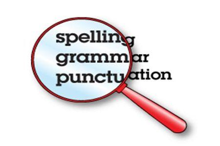
Just like your online content, grammar is essential to make your work professional. If the texts in your designs have spelling and grammatical errors, it will destroy the confidence that clients have in you as a graphic designer. You should read a proofread to make sure that your designs are error-free. Although using a spell check system simplifies the process, they can easily miss some. It is therefore good if you can go through your designs manually to achieve perfection. A good example is when distributing leaflets as part of your campaign and they have many grammatical errors. Customers will easily ignore the business teeming it as unprofessional.
Conclusion:
You should always take your design work very seriously since it gives an impression of your company. If the designs are shady, clients will not trust them. Keep your web designs simple and straight to the point when seeking Web design services. Don’t clog your readers with many unnecessary, text, fonts, and colors. Keep everything professional by delivering what you promised and avoid making promises that are hard to keep. Always stick to the client’s directive and if there is anything you feel like adding, consult the client first before implementing it.


1 Comment